Designing a saucy brand for a barbecue restaurant.


We were challenged by a young entrepreneur to think about a name and brand for a modern steakhouse.
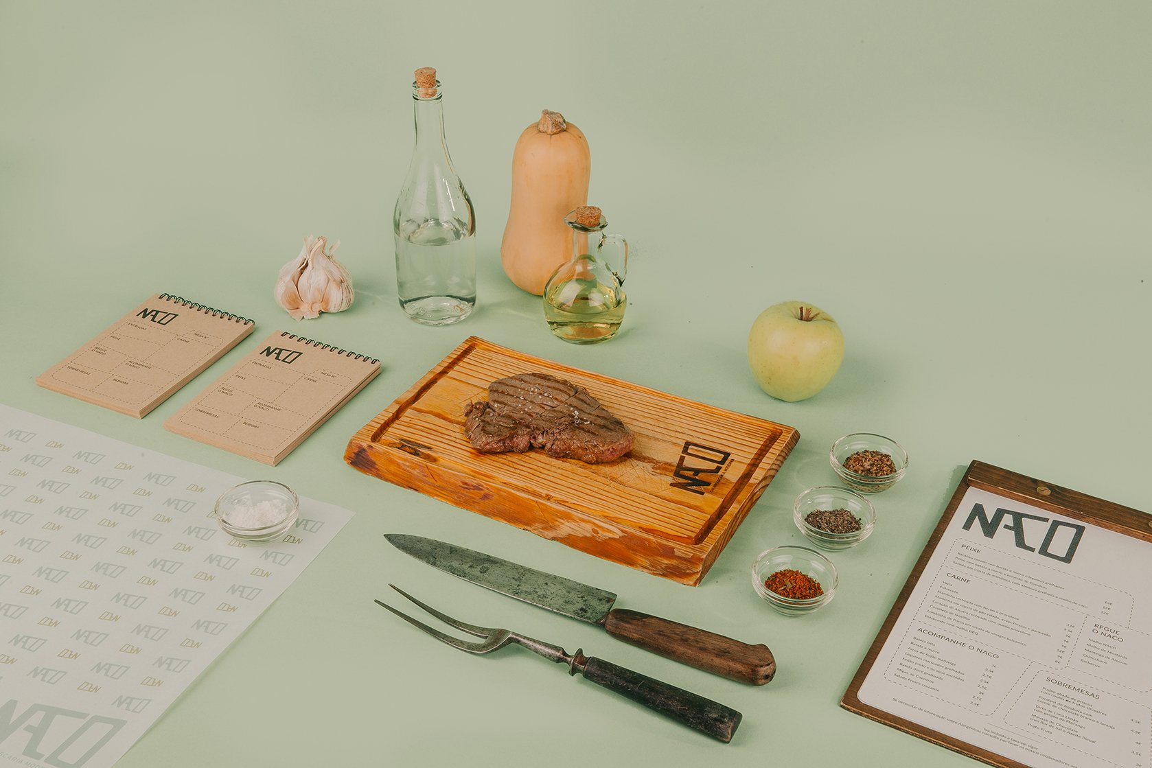
After a few tastings in different restaurants we nailed what makes the best steak: its size and juiciness. From there it was easy because there is one Portuguese word that sums these two characteristics: NACO. The design was then inspired by the idea of modernising a staple of Portuguese cuisine, so we created a logo that literally represents a classic piece of meat while using a clean, and almost austere lettering. The colour scheme is a blend of light browns and greens inspired by the copper tones of older kitchen utensils. Finally, playing with the duality of the word NACO, we developed a saucy brand manifesto that is used to tease customers in communication materials.


