Bringing happiness to pharmacies’ shelves through packaging design
ToLife, one of Iberia´s largest generic medicine manufacturers, wanted to revamp the packaging design of its over-the-counter products.
In Portugal, this kind of product is sold exclusively in pharmacies and not directly accessible to the consumer. The briefing was simple but challenging: how can we stand out from all our competition sitting by our side on the shelf? How can we stay true to our brand’s essence and convey an idea of happiness when we are talking about disease and medication? How can we get closer to an important target: tourists and foreigners visiting or living in Portugal?
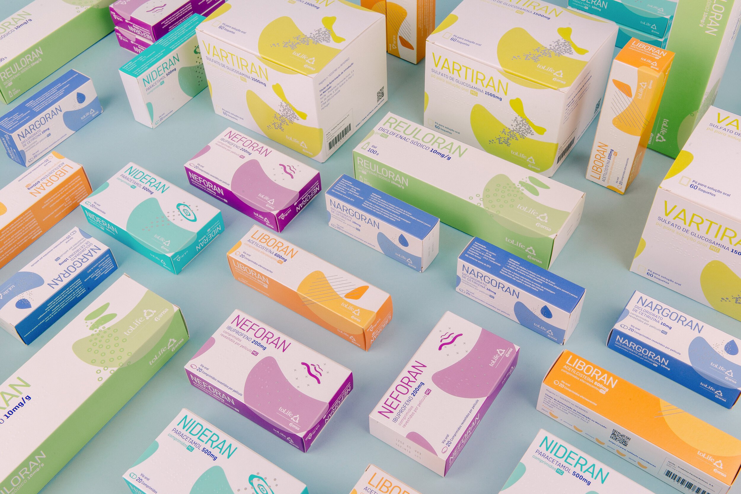
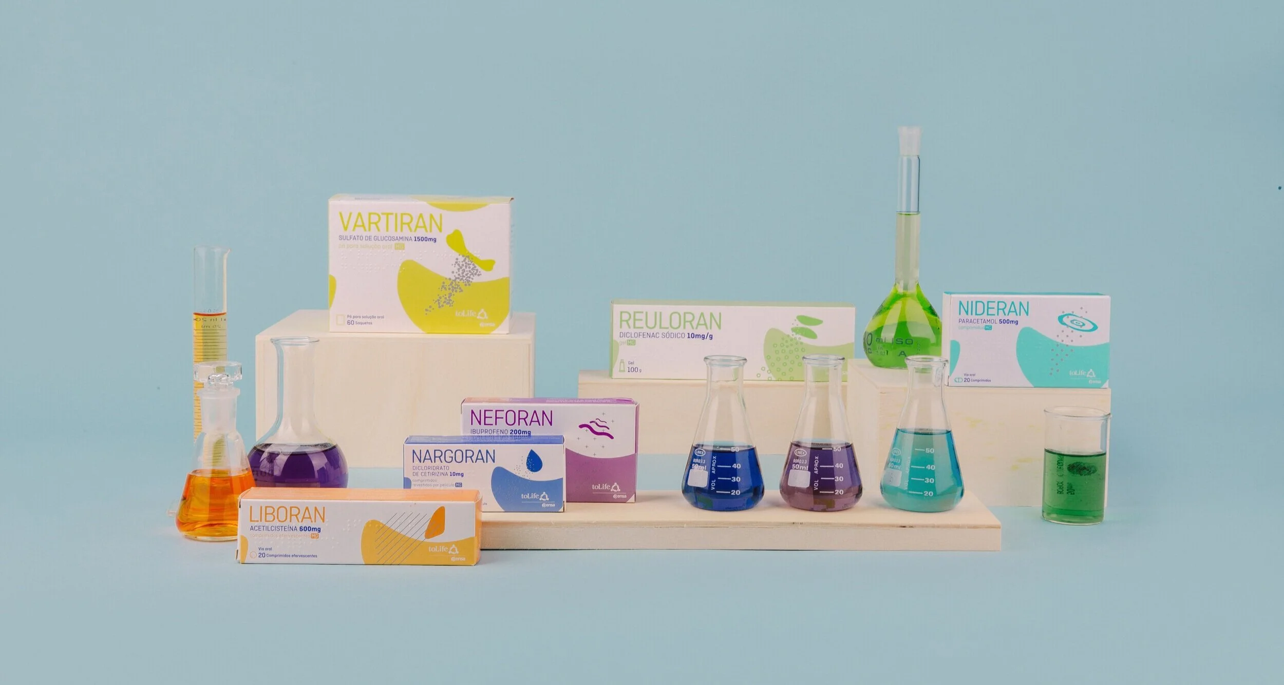
Taking inspiration from their logo, which represents a human embrace, we developed a symbol, that was common to all 6 products, and that allowed the boxes to fit together to form a bigger image of a smile. This not only created a stand-out effect on the shelf, but also transmitted a positive feeling to the pharmacy’s clients and staff alike. Each product then had its own colour scheme and an additional design element that was specific to the symptom being treated.
To answer the target challenge, we introduced, for the first time in the Portuguese market, a QR code in the packaging. By scanning the code, anyone can have direct access to the information leaflet in 6 different languages, simply and effectively.
partners
Francisco Pitschieller
3D design
Isabel Pires Vieira
Design


